UI Design for the Fitness App UP!
Based on a project brief by CareerFoundry, my task was to design a Fitness app targeted towards a busy, full-time working persona. One of the main objectives that the app should fulfil is to make the initial approach to work out as accessible as possible given the lifestyle of the user.
The Concrete Jungle as your Playground
Starting from this project brief, I have continued to craft the persona further by taking the environment and personal needs into consideration. I imagined the user being able to make the surface of an urban city their own playground for their workout: A walk to the train station, the stairs leading up to another level, the parks embedded in between the concrete patches, they all serve as an opportunity to get the training started, wherever our persona was during their day.
The result was a moodboard that defined the outline of the qualities I envisioned for both the user and the app design. During the creation of the moodboard, I have taken on a new approach to implement the human’s five senses and how these sense might be triggered in a city. It encompasses the colors, the atmosphere, a feel of the materials involved and the city as an active playground to embed in the design.
In the upcoming segments, my role was
to define the design and refine the user persona in order to get a better grasp of the user’s needs ( Moodboard)
design a layout for different breakpoints in order to showcase the presentation for different devices (Layout design, wireframing, prototyping)
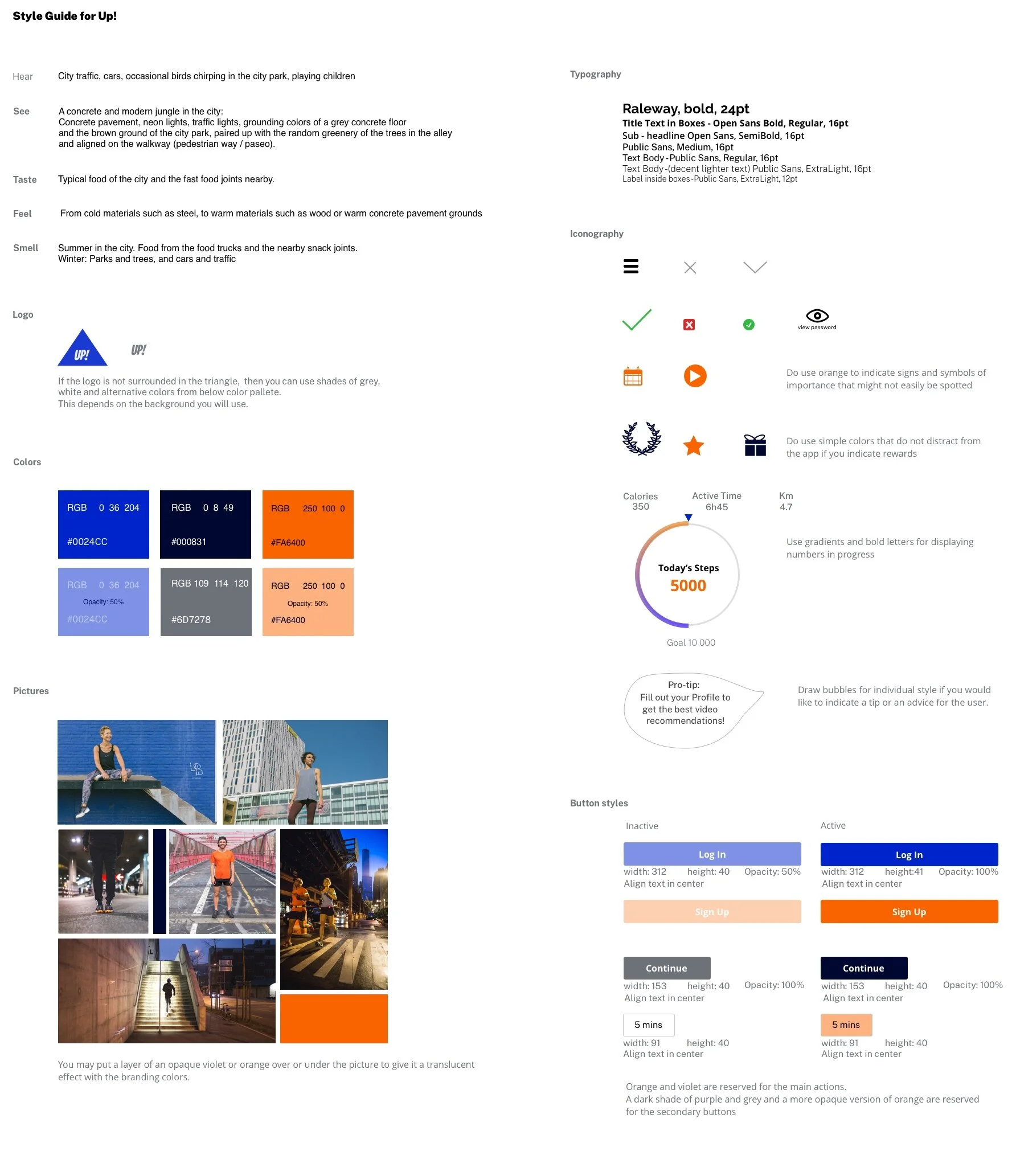
articulate the brand’s identity and ensure its consistency (Styleguide)
The tools I have used for this project are:
Sketch
InVision
The Moodboard
Layout
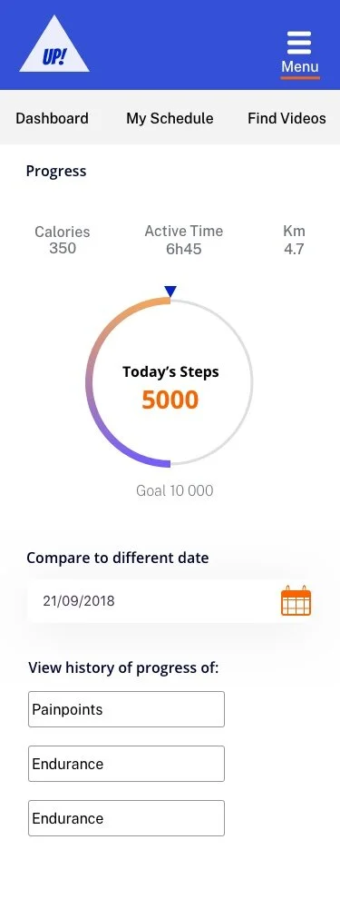
Based on the selected elements taken from the moodboard, I have sketched out the wireframes. Starting with Sketches and working them out to mid-and high-fidelity wireframes.
Mobile
Tablet
Desktop
Style Guide.
In order to maintain a consistent brand and branding presentation, a style guide was created. In this style guide a direction of how the feel and tone is supposed to feel like in order to facilitate to imagine the right composition of colors, sizes and visual language.


